THE POINT.
The identity behind this portfolio: how a circus arena, a dart and one red dot became one system for a website, a CV, a showreel and an email signature.

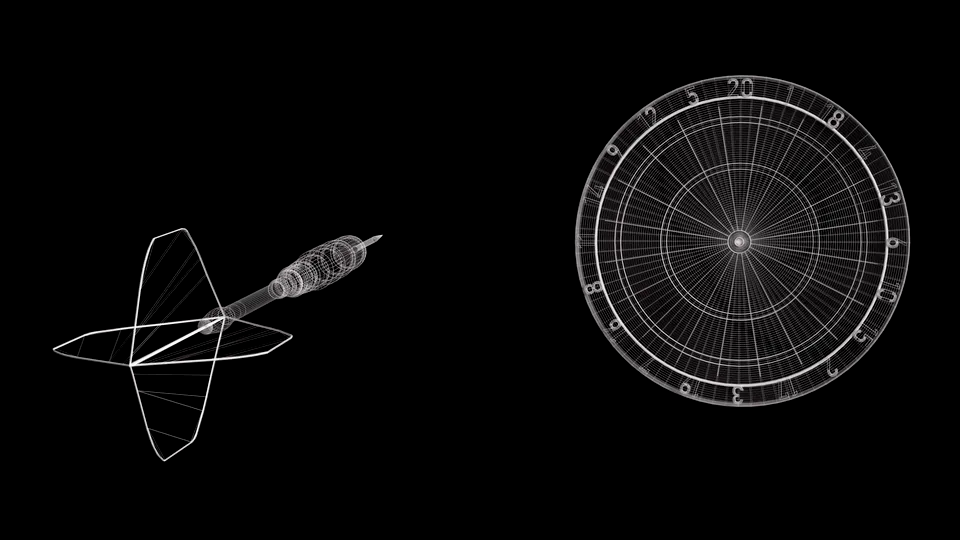

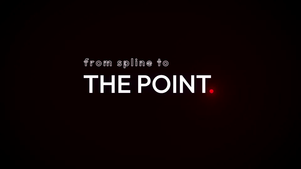
Every colour is sampled from the circus arena HDRI that lit my film.
The logo is my name and one red dot, placed exactly where a full stop belongs.
The same rules on the website, CV, cover letter, showreel and signature.
What is the core of my work?
That was the first question I asked myself. My answer: performance, motion, strategy, playing with light, and one goal: getting valuable information across simply and clearly. Interesting, but never careless.
The spline is my tool. THE POINT is the finale.
That is why the film on my homepage shows a dart hitting the bullseye: a well-worn theme that everyone understands, made different through its details rather than its subject. I design interfaces the same way: build on patterns people already know, so nobody gets frustrated, and make the details distinctive enough to intrigue.
Every colour comes from one HDRI
To light the dart I deliberately chose a circus arena. It stands for acrobatics, motion and childlike joy: something light, yet festive and out of the ordinary. The HDRI lit the film, and every colour of the brand was taken from it, then tuned for screens and contrast.

- 1Ceiling bulbs#f6ce29 → #ff9f1c
- 2Stage light#32a4ed → #5fd0ee
- 3Carpet#d4061a → #e1002d
- 4Wooden panels#7b3044 → #631e26
- 5Dark auditorium#2b151d → #0c0709
Buttons, links, focus, active states. Only things you can click.
Tags, status, tools, categories. Never clickable, also in my CV.
The dot and its glow. Rare, so it stays strong. Never used for text.
Base, text and glass surfaces carry about 90 % of the page.
All design tokens and contrast values12 tokens · measured against the base colour
Design tokens
Every value lives as a CSS variable. The number is the contrast against the base colour.
--bg · #0c0709--ink · #f7f3f4--ink-soft · #c4b8be--accent · #ff9f1c--accent-text · #ffbd5c--cyan-text · #8fe0f5--crimson · #e1002d--crimson-glow · #cd001c--cta-from / --cta-to · #f5b947 → #f2890d--success / --danger · #5fd38a / #ff5c6c--glass / --glass-edge · rgba(255,255,255,.035–.07)rgba(99,30,38,.38) · background glowContrast (WCAG 2.2)
| Token | Use | Contrast |
|---|---|---|
| --ink | Headings | 18.2:1 · AAA |
| --ink-soft | Body text | 10.4:1 · AAA |
| --accent-text | Small amber text | 12.1:1 · AAA |
| --cyan-text | Information | 13.5:1 · AAA |
| --crimson | Dot only, never text | 4.0:1 · decorative only |
The dot is the logo
I think a topic through before I design anything: think a lot, say little, hit the point. That idea became my claim, “from spline to THE POINT.”, and the red dot is where it lands.
Think a lot. Say little. Hit the point.
So the mark is simply a red dot: energy, simplicity, action. There is no separate symbol. The logo is my name set in Outfit, finished by the dot, which sits exactly where the typeface’s own full stop would sit, only larger. It also works on its own: in the film title, the favicon, the status chips and the showreel.
Rules
- PositionOn the baseline, exactly where the full stop of the typeface sits, set 25 % larger than the text
- Clear spaceTwo dot diameters on every side (dashed frame)
- Dot colourAlways red #e1002d with its glow; white only in the one-colour version
- NeverA white full stop next to the red dot, a raised dot, amber or cyan dots, outlines, distortion
 Favicon · browser tab
One system, every touchpoint
Corporate identity means the same rules everywhere a recruiter meets me: the same red dot, the same amber for actions, the same cyan for information. Private contact details are blurred here.

Homepage with the brand film
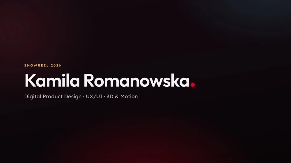
Title card
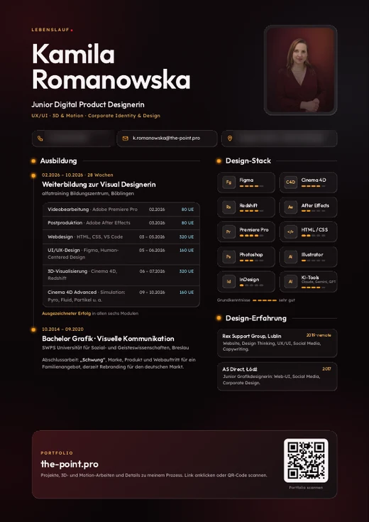
For email and online
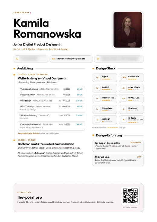
White paper, same system
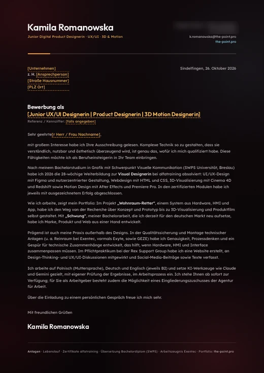
Template
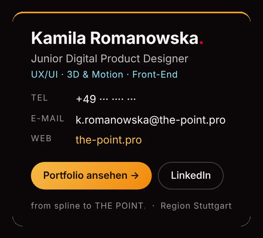
Text only, no images
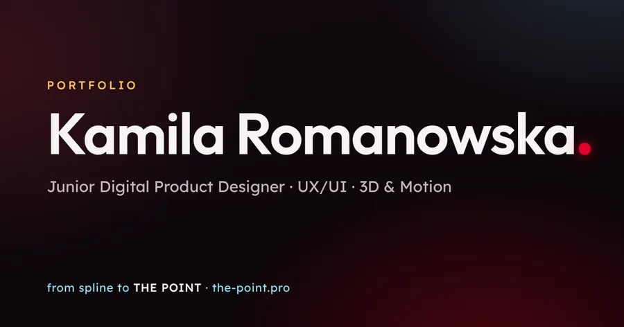
Shown when the link is shared
Typography, light and motionOutfit + Lexend · lighting rule · timings
Two typefaces, one voice
Outfit for headlines: geometric and confident. Lexend for everything you read: a typeface developed for reading fluency. All values come straight from the site’s CSS; the root size is 95 %.
clamp(2.5rem, 6vw, 4.1rem) · 38–62 px · line-height 1.03 · tracking −0.015em
clamp(1.7rem, 3.5vw, 2.3rem) · 26–35 px · line-height 1.15
1.18rem ≈ 18 px · line-height 1.5
1rem ≈ 15.2 px · line-height 1.6
min. 12 px · tracking +0.025em
Lit like the arena, moving like a dart
Red rises from below like light bouncing off the carpet. Cyan falls from above like the stage light. Amber is the spot: where the eye should go.
- UI · 200–250 msease: buttons, cards, links. Quick, never jumpy.
- Media · 500 msSoft zoom on thumbnails
- Film · 900 msThe hero film fades in instead of popping up
- Curvecubic-bezier(.45, 0, .2, 1) · slow start, firm landing, no bounce
- RespectReduced motion is honoured; every loop has a pause button
How the film itself was made, from sketch to render, is on the making-of page. Making-of →
Live components and accessibility rulesButtons, chips, cards · WCAG 2.2
Live components, not screenshots
These elements are the real CSS of the site. Hover them or move through them with the Tab key.
Buttons
Pill radius 999 px · min. height 44 px · Lexend 500 · gradient from tokens
Chips & card
Wohnraum-Retter
Hardware, HMI and app for a smart deposit-bottle compactor.
Radius 26 px (cards) / 16 px (inner) · padding 1.75 rem · glass + hairline top highlight
Accessibility is part of the system
The brand only counts if everyone can read it. I audited every page against WCAG 2.2 and turned the results into rules.
- TextNothing smaller than 12 px; lead paragraphs limited to 75 characters per line
- Focus ring2 px amber ring with 3 px offset on every interactive element
- TargetsButtons at least 44 px high, small links at least 24 px
- MotionPause buttons for every loop, reduced motion respected
- StructureSkip link, landmarks, one h1 per page, English and German with the right language tag
- FilmsNo speech; the films in the case studies come with a written description
Icons are simple line icons with a 1.8 px stroke and round caps, only where they help: phone, mail, download, print.
Built with AI, directed by me
This website was built with AI-driven design, together with Claude. It did not start with “make me a portfolio”, but with my own material: Figma screens and wireframes, the HDRI, my films and renders, research, texts and a plan for every section.
- Storyboard first
Content and visuals for each section were ready before any code, like a storyboard for a film.
- Section by section
We built one section at a time. I reviewed every version and decided what stayed.
- Deliberate choices
The AI proposed options; I chose, down to how far a gradient may reach into the hero film.
- Measured, not guessed
Contrast and accessibility were measured on every page. When numbers and taste disagreed, the design changed.
With AI, the real skill is knowing what you want, preparing the material and judging the result. The tool writes the code; the decisions are mine.
What I changed along the way
- Three reds became one
Carpet, dot and wood each had their own red. Now there is one, sampled from the dot in my film, plus its glow.
- Cyan stayed, with a job
It is the stage light in my HDRI, so I kept it, but only for information, never for anything clickable.
- Eight button gradients became one token set
Every primary button now reads the same four tokens.
- Small type grew up
Labels went from 8.8 px to at least 12 px, and every page passed the audit.
Want to see the system at work? The case study shows it on a real product.
Wohnraum-Retter case study →